Designing Refly: Typography, White Space, and the Reader's Eye
It began with a simple question: In a world of infinite scrolling, how do we create a digital space that feels like a library? This is the story of how we built Refly’s visual identity, moving away from the "utility" look of early web design toward the "editorial" look.
The Return of the Serif
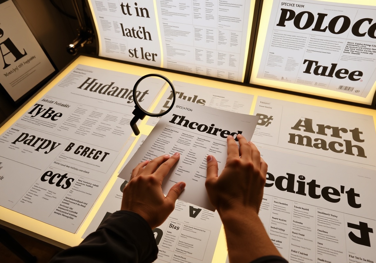
For the first decade of the web, sans-serif fonts were the default. They were clean, modern, and legible. However, for a magazine focused on depth and narrative, sans-serif often felt too clinical—like a document rather than a story.
We chose Playfair Display for headlines to evoke the authority and warmth of printed newspapers from the 1940s, and Inter for body text to ensure crisp readability on all devices. This typographic pairing creates a bridge between the nostalgic feel of analog reading and the utility of digital media.
"We wanted to strip away the visual noise of the web. The result is a palette of warm neutrals that puts the content first, not the interface."
— Sarah Jenkins, Art Director
White Space as Structure
Design is not just what it looks like and feels like; design is how it works. In the context of Refly, whitespace is not an empty void—it is a structural element. It gives the reader's eye a place to rest between paragraphs and sections.
We utilized a 68-character line length constraint. This is a standard in editorial design to prevent the eye from having to jump across long lines of text, which causes fatigue. By adhering to this constraint, we ensure that reading remains a fluid, meditative experience.
"Whitespace is like a pause in music. If you fill every second of a song, the melody gets lost. We leave silence on the page so the words can speak."
The Color Palette
Our palette draws from the natural world—earth, stone, and paper. The background is a warm, off-white ivory (#F7F4EE) rather than stark white (#FFFFFF), which reduces eye strain during long reading sessions. The primary text is a deep, matte ink (#1A1814), providing high contrast without the harshness of pure black.
We introduced sage and sienna as accent colors, used sparingly for highlights, buttons, and pull quotes. These colors act as subtle navigational cues, guiding the reader's eye to important actions without breaking the editorial flow.
About the Author
Alex Thorne is a Senior Designer and typographer based in Brooklyn. He has spent the last decade working with publishers to modernize their digital presences while maintaining the integrity of print traditions.
May 14, 2024